

Simon Says Stamp - Water-Painted Distress Oxide Backgrounds
- Keisha Diann

- May 21, 2021
- 4 min read

Earlier this week I shared posts showing my new Spring and Summer Seasonal Palettes and Blending Swatches, both of which I used to guide my choices for these cards.
I can get pretty stressed out about color choices so it was nice to have a proven recipe to follow rather than figuring it out when I just want to start making the cards.


I used Distress Oxides for this technique, but Distress Inks will also work well here, as both have beautiful reactions to water.
Simon Says Stamp's Spring Bouquets Stamp Set is perfect for this technique as you will need a stamp set with simple line art and preferably no interior details/shading.

I love the showy results that you get from this simple trick and I will show you a easy way to amplify the contrast between your painted image and the background.
Key Supplies
Tim Holtz Distress Watercolor Paper
Simon Says Stamp Sentiment Strips - Reverse Encouraging Words
Various Distress Oxide Ink Pads (see supply list at bottom of post for details)


A full supply list is available at the bottom of this post.
MAKING THE BACKGROUNDS:
I went directly to my new blending swatch binder and selected two of the blends that I liked the most to use in these projects. When creating this first batch of blending swatches, I was focused on mixing colors with Salvaged Patina.
I blended Salvaged Patina Oxide with some colors from my Spring Palette and also with some colors from the Summer Palette.
SPRING PALETTE
This is the blend for the Beautiful card.
Salvaged Patina
Kitsch Flamingo
Dried Marigold

SUMMER PALETTE
This is the blend for the You are Epic card.
Blueprint Sketch
Salty Ocean
Salvaged Patina

Both cards are Slimline-sized (3.5" x 8.5"). The Epic card is vertically oriented and starts with the darkest color (Blueprint Sketch) at the bottom and continues upward with Salty Ocean and then finishes with Salvaged Patina.
The Beautiful card is horizontally oriented, starting with Salvaged Patina at the bottom and continuing upwards with Kitsch Flamingo and then Dried Marigold.


After ink-blending, heat-emboss the vertical rose image from the Spring Bouquets Stamp set in white for the You are Epic Card (as shown below) and repeat for the horizontal bouquet image from the same set, in gold for the Beautiful Card.


With that complete, they are ready to coloring
COLORING THE BACKGROUNDS:
Rather than adding color, for this technique, you are simply removing color by painting inside the image boundary lines with water.
Tip: I use a water brush, but because I get nervous about adding too much water to the section that I want to color, I also add a little puddle of water to my craft mat that I dip into as I move from one section to another on the image.
To start, wet the tip of your brush with water and paint inside the lines of a section of the image (like the leaf in this example) to wet this portion of the image. As the Distress Oxide/Ink reacts with water, the color of the wet section will lighten and continue to get lighter as it dries.
Keep a piece of paper-towel next to you to dab up excess water from your brush and to soak up the color that you are "absorbing" into the brush as you paint the image.


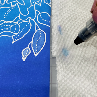
Continue this process until you have "painted" inside the lines of the entire image.
Tip: If you would like to further enhance the contrast between the background and the "painted" image:
Dab a little white ink like Hero Arts Hero Hues Uniform Pigment Ink onto your craft mat
Dilute about 50% with water
Use the water ink to paint inside the lines of your image
I used this approach to highlight certain parts of the flowers and leaves and allow them to "pop" more on the overall image.
When complete, set your backgrounds aside to dry while you work on your sentiments and embellishments.
EMBELLISHING & ASSEMBLING THE CARDS
Using the Simon Says Stamp Capital B Beautiful Die, diecut Beautiful three times: once with gold foil cardstock; twice with white cardstock.

Layer these diecuts to create greater dimension and visual interest on your card front.
Repeat with the "you" from Simon Says Stamp CZ Design Swoopy Thank You Die, instead using silver foil cardstock for the top layer.
Prepare the other sections of your sentiments by snipping "YOU ARE" and "HAPPINESS LOOKS GOOD ON YOU" from the Simon Says Stamp Sentiment Strips - Reverse Encouraging Words.
Foil the "HAPPINESS LOOKS GOOD ON YOU" in pink.
Assemble as shown below on Simon Says Stamp Slimline White Scored Cards. Add PinkFresh Studio Jewels Mix Essentials in white on the "You are Epic" card and turquoise on the "Beautiful" card.


This techniques is so easy and fun that I hope you will experiment with it as well. Let me know in the comments what blends are your favorite. Full supply list below for your shopping convenience.
See you soon Lovelies!
SUPPLIES:
I listed the products that I have used below. Please note that these are compensated affiliate links used at no cost to you. I really appreciate your support. Simon Says Stamps Born to Sparkle Release products were provided as part of my Design Team package. Click on the icons below each product picture to shop with SimonSaysStamp.com.


Kaiser OTC benefits provide members with discounts on over-the-counter medications, vitamins, and health essentials, promoting better health management and cost-effective wellness solutions.
Obituaries near me help you find recent death notices, providing information about funeral services, memorials, and tributes for loved ones in your area.
is traveluro legit? Many users have had mixed experiences with the platform, so it's important to read reviews and verify deals before booking.
cool
replika rolex day date
replika rolex daytona
This was a *great* blog post—one of the best I’ve seen. Your steps were clearly written and documented with your photos. Thanks so much for sharing your designs with such excellence!
These two cards are so very, very beautiful Keisha. I love the way you made them, it looks so complicated but isn't. Thank you so much for the tutorial, for sharing your beauties, stay safe and have a wonderful Sunday.❤️❤️❤️
What a great idea. I will definitely try that!!!