

Simon Say Stamp - Pawsitively Saturated Ink Gradient Swatches
- Keisha Diann

- Jun 30, 2022
- 3 min read

Hello Lovelies! I feel like I have a beautiful rainbow of Simon Says Stamp Pawsitively Saturated Inks now and decided to make myself a Gradient/Color Family Chart!
I arranged this chart by color family as the Pawsitively Saturated inks come in gradient groups of 3 shades, a light, medium and darker color. There are four pages to my chart and the below picture is showing them stacked one on top of the other. Keep scrolling for individual shots of each page.

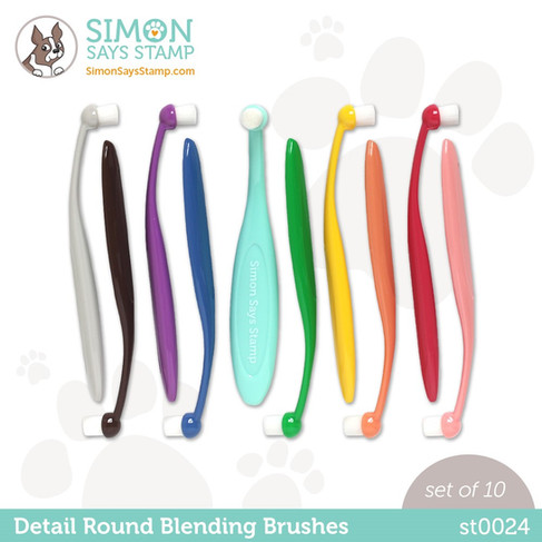
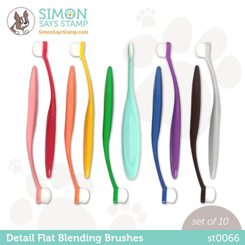
I made a PDF sheet with the ink labels and left space at the bottom to add a color combo using the colors in that family. (Jennifer McGuire has an editable 2x2 swatch chart that you can also use to create your labeled sheet). I then used a stencil and Round Detail Blending Brushes to color the large swatches and the Flat Detail Brushes to color the combo swatches. I did the color combos for the 1st page and will work on the other pages later.
Essential Project Supplies:
BRUSHES & INKS


STENCIL

Click here to view the full supply list or check it out the one linked in the gallery at the bottom of this post when you have finished exploring this card.
Today's GIF!
A rainbow is always welcome in my craft-room!...🎉
SIMON SAYS STAMP PAWSITIVELY SATURATED COLOR FAMILY SWATCH CHART - Stenciling
Chart: 8 1/2" x 11"
Featuring:
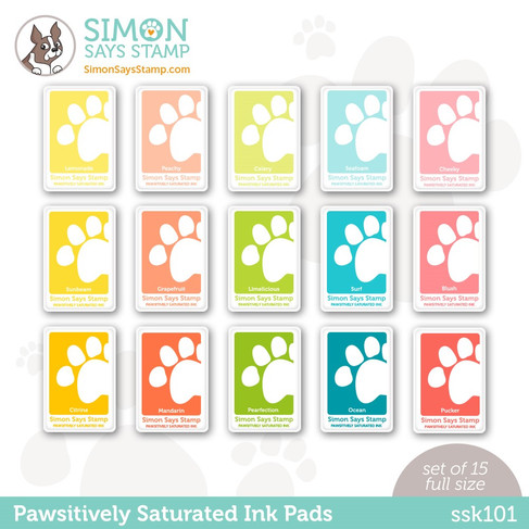
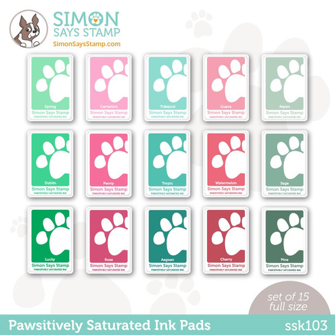
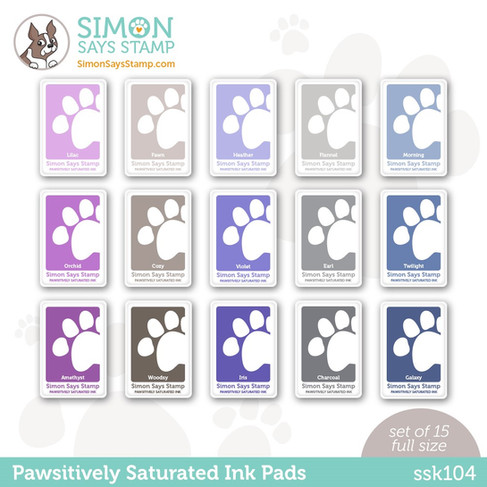
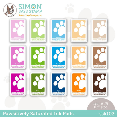
Simon Says Stamp Pawsitively Saturated Inks
Simon Says Stamp Detail Blending Brushes - Round, Flat
Altenew Color Swatch Stencil

PAWSITIVELY SATURATED INK CHART - PAGE 1

PAWSITIVELY SATURATED INK CHART - PAGE 2

PAWSITIVELY SATURATED INK CHART - PAGE 3

PAWSITIVELY SATURATED INK CHART - PAGE 4

(not sure why I have the darker spots in my grey color family, I think I got hand lotion on my swatches!!! I will redo this page at a later date and refresh this photo)
I took some close-up photos of the pages with the latest Pawsitively Saturated Ink colors because I am IN LOVE, so do keep scrolling for some eye candy!!


PROJECT WALKTHROUGH
1. Secure 80lb Neenah white cardstock sheet to a Wendy Vechhi Make Art Staytion using Frogtape.

2. Tape pieces of scrap paper to the left, right and underneath the large rectangular swatch opening to isolate it and make it easy for your stenciled ink not to get into the other openings on the stencil. Tip: I used the magnetized ruler to hold the stencil in place over the labeled cardstock sheet.

3. Use the cut marks (these little dashes) to align the swatch boxes. Then tuck another scrap of paper above the swatch box so you don't ink above the stencil (where my finger is pointing).

4. Apply the ink using a Round Blending Brush. Tip: It looks uneven here, but will settle into the paper and dry evenly.

5. For the combo swatches, use the Flat Blending Brush to apply the ink in gentle vertical strokes.

Here is a closeup of the finished combo swatch. Did you see my little mistake on the navy stripe?!!

I'm digging these combos, I will note the colors on the back of the sheet.


I like that these will also help me pick color palettes for my project by looking at all the pastels (top row of each sheet) togethetr (see below) or maybe looking across the medium or dark tones together, depending on the look that I am going for!

These can be cut into vertical color family strips to make a paint fan swatch book or into 2" x 2" swatches to go into a color binder. Maybe I will give that a try and share that later.
Comment and let me know if you would like to see more or this or if it was helpful in any way. Please let me know about what changes you would suggest as well.
Thank you for stopping by and see you soon!
SUPPLIES:
I listed the products that I have used below. Please note that these are compensated affiliate links used at no cost to you. I really appreciate your support. All stamps used today were part of my maker package from Simon Says Stamp. Click on the icons below each product picture to shop with SimonSaysStamp.com.


Trump threatens Erotske price new tariffs on European allies over Greenland until deal reached, as thousands protest
Trump threatens סיפורי סקס new tariffs on European allies over Greenland until deal reached, as thousands protest
Trump threatens Erotiske noveller new tariffs on European allies over Greenland until deal reached, as thousands protest
Trump threatens Seks hekayələri new tariffs on European allies over Greenland until deal reached, as thousands protest
Trump threatens Seksinovellit new tariffs on European allies over Greenland until deal reached, as thousands protest